


What colour paint did the Victorians use?
The traditional Victorian colour palette was dark and consisted of dark, rich and deep shades of maroon, red, burgundy, chestnut, dark green, brown and blues. Maybe this sounds a bit dramatic for your tastes but you can mix this possibly overwhelming colour palette with lighter shades in the following way. You could choose a dark shade with contrasting white-painted woodwork, light fireplace tiles and a pale-wood floor to really make your Victorian tones take centre stage.
Whilst the deep chocolate browns in many Victorian houses could sometimes give them a dreary feeling, you can pay homage to this mood with dark greens and blues, which may be more likely to be to your taste.
Pastel shades do not form any part of the Victorian palette. Instead they would use off-whites (never brilliant whites), creams and toned down versions of their strong colours. To go subtle but not be too far from the Victorian palette, choose creams and buttermilk and then add one strong Victorian shade for a truly period feel. To be authentic, a room should strictly be decorated using varying tones of the same colour. Your darkest shade should be below the dado rail, while the wallpaper or paint above it should be a little paler, with your woodwork lighter still.
What colours should I use to create a traditional looking kitchen?
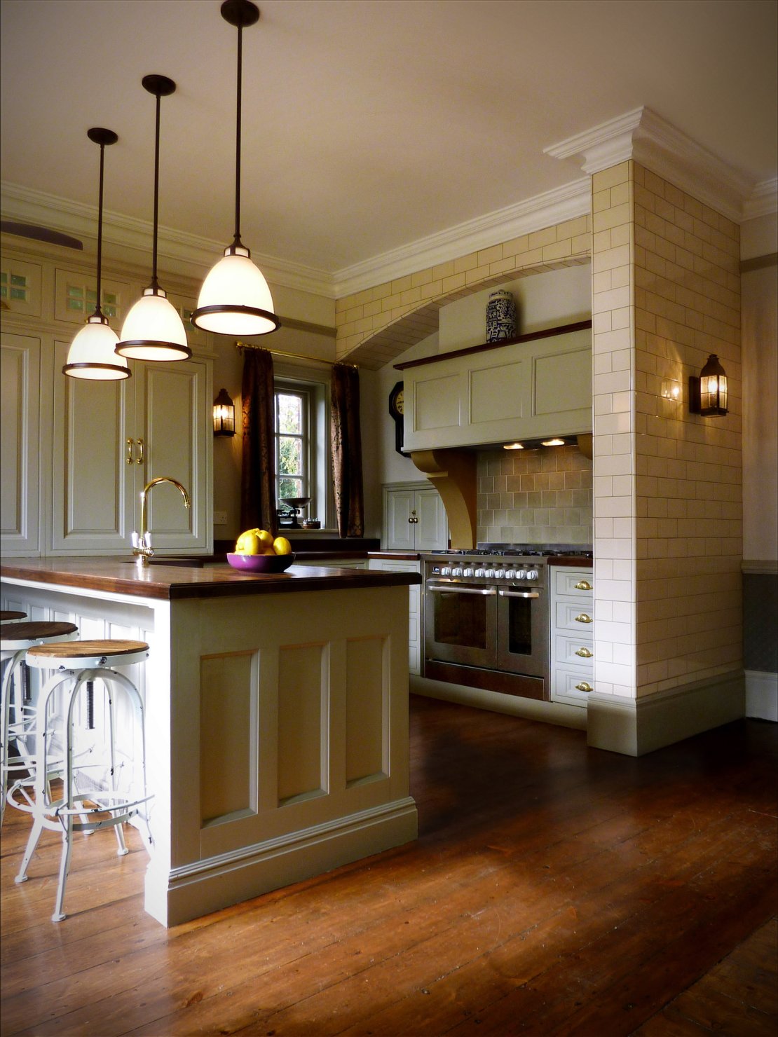
For a different application but using the same method as above, you can create a fabulous expensive looking kitchen at a fraction of the cost by painting inexpensive kitchen cabinets in a colour a few shades darker than your kitchen walls. Spray-paint the cabinets before installation (they’ll need three or four coats) and add brass handles and classic dentil coving around the cabinet tops to complete the look. This can transform diy chain kitchens from something potentially cheap and offputting to something approaching the look that the designer kitchen shops create. Look for a kitchen style with period type mouldings in wood if possible to get a good base product for you to add your finishing touches to.
How should I decorate Victorian relief wallpapers?
The Victorians loved to show off their wealth and good taste in the decoration of their homes, using lots of varieties of colour, texture and eye-catching designs. Lincrusta and Anaglypta wallpapers perfectly fitted this bill and were easy to clean and hardwearing, practical and able to hide rough and uneven walls that might otherwise need replastering.
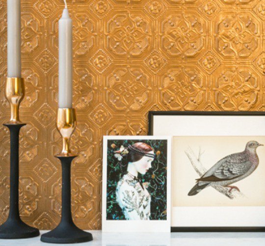
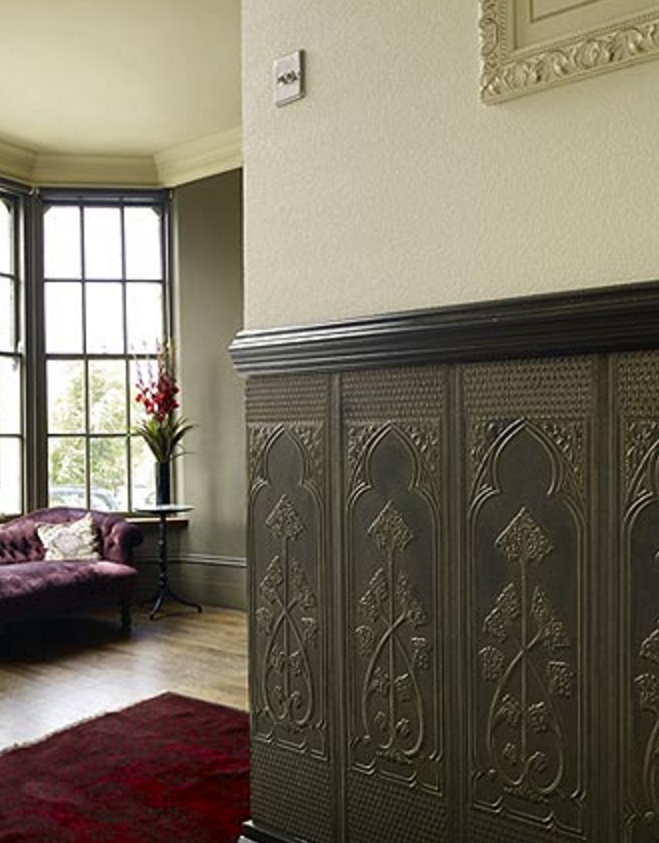
If you choose to use one of these below your dado rail, you could paint it in a deep colour like the Victorians. You can then lift the effect by using a patterned paper or paler paint colour above the dado rail. Papers including a metallic reflective colour work especially well to add light onto dark walls.
What colours should I choose for panelling?
If you don’t have any original oak panelling in your period house, you can create a similar effect by building cupboards/enclosed bookshelves or fitting fake panelling in mdf or pine, and then adding period-style mouldings for extra detail. For diy panelling, take flat pieces of wood or mdf, fix to your walls, frame the wood with squares or rectangles at regular intervals made out of pine beading and add a dado at the top and skirting at the bottom. For a quick simple solution you can use our wall panelling kits. Paint in a moody dark grey, dark blue or even an off black for maximum impact. White can also be used and is especially effective in a dark room. Finish off surrounding woodwork in the same colour. This can make an otherwise boring wall into something really special for a relatively low cost.
Floors
Victorians coveted oak floorboards and often stained cheaper pine floorboards darker to replicate oak. To do this yourself, sand down your floorboards to get rid of any stains and rough finishes. Then choose a stain to your chosen colour and paint the stain on the floorboards. Finish with 2 or 3 coats of varnish. In high traffic areas we thoroughly recommend varnish used for squash courts to give a long lasting finish. Then add a traditional rug for the full Victorian treatment.
Luckily we benefit from much better lighting than the Victorians did, so even with darker colours on walls, lights can be used in such a way that they do not appear gloomy, but simply vibrantly coloured and individual. Plan your lighting carefully to make the most of your period-style schemes. In Victorian reception rooms, wall sconces with a central chandelier works a treat.
Posted by Lynna Karanutsos - Jun 08, 2019 - 21:44
I’m buying a 1885 Victorian apporox 4000 sq. ft.
Down stairs is all original dark molding, oak floors.
Upstairs all traditional molding painted white.
I’ve seen Shades of purple with the dark molding, Can anyone tell me the best PURPLE shade to use with Victorian themes?
APPRECIATE
Lynna
Posted by Lindsey kadzevski - Jan 21, 2021 - 21:49
I have 2 rooms running together I’m in a Victorian terrace and have painted 1 room a Victorian quite deep red, (eating room red on tin). Because you can see into the other room should I paint it the same or a different colour
Posted by Stuart - Dec 13, 2022 - 10:37
Just thought I would share that I have a late Victorian (1899) that I have been restoring and that after removing layers of wallpaper from the 1900’s I have found that the original coats of distemper paints are not at all dark or dramatic. Do you think this is due to changing trends or perhaps an odd homeowner?