


A good place to start is by using the colour chart of a historic paint collection such as Farrow and Ball’s. Farrow and Ball state: “Many Farrow & Ball colours are rooted in the past enabling you to create a decorating scheme that is sympathetic to the age of your home.”
Just having one of these charts to hand will help you discover a range of colours and depths of shade used in the Victorian period. This will help to decide whether you need a stronger or subtler colour scheme. Always remember to test paint colours on a small area of wall before you paint an entire room, as they tend to look different on the wall due to the natural and artificial light.
What is the Victorian colour palette?
Typically, houses decorated in the Victorian era used strong, deep colour schemes such as blues, greens, reds and yellows. The main issue with the Victorian colour scheme is the deep shades, sometimes making rooms look very dark. Therefore in rooms where light is required, such as kitchens and bathrooms, deep shades should be avoided, even if you use them on shelves, cabinets and accessories.
Wallpaper became very popular during this period because they were often more affordable with cheaper methods of production; largely featured damasks, floral, bird and animal motifs, which were common with grey and neutral background colours.
Ornate plasterwork used on ceilings, roses and cornices was usually decorated in white or off white.

What is the best colour scheme for each room?
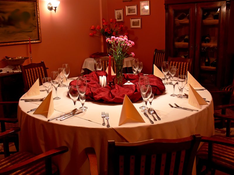
If you're wondering which victorian colour scheme to use for each of your rooms, it is worth considering what the colours were associated with and why they were particularly used. Red is a great choice for a dining room as it stimulates appetite, social and lively feelings. However, it can be overpowering and lead to headaches. If your room has a dado rail, use a lighter red above the dado and a deeper shade below. You can paint your woodwork a contrasting shade of white to bring some lightness into the room. Strong colours can work wonderfully in Victorian dining rooms, creating a dramatic, intimate atmosphere that’s perfect for entertaining. Rich tones work especially well in dining rooms that are often lit by candlelight - choose some large ornate candelabras or candelabra style wall sconces to really make your wall colours take on a warm sumptuous quality.
A great choice for a living room is green as it is calming and restful and promotes feelings of security and stability. Mix it with some lighter shades on soft furnishings and accessories so that the green can really sing.
Blue - calming and soothing – is a great choice for a bedroom. Blue is purported to promote intellectual thought, serenity and prevent nightmares. To ensure it doesn't look too cold, choose a blue with a warm hue. Green is also a great colour for bedrooms due to it’s calming and restful properties.
A top choice for kitchens and kitchen/diners from this particular period is yellow, associated with summer, sunshine and energy - a colour scheme to stimulate the intellect. Yellow can instantly brighten up a room but also has a soothing quality and will aid a feeling of calm and happiness in the kitchen. Yellow can make rooms feel bigger and brighter, and matches in well white and grey used as accent colours. Another winner for kitchens is a good dollop of white giving the feeling of cleanliness and zing.
Grey is a neutral colour that is being used widely in period homes nowadays. If you use the right shade, it can look great in a kitchen and provide a wonderful backdrop to colourful items such as chairs and kitchen accessories.
What colour scheme should I use for the exterior of my Victorian house?
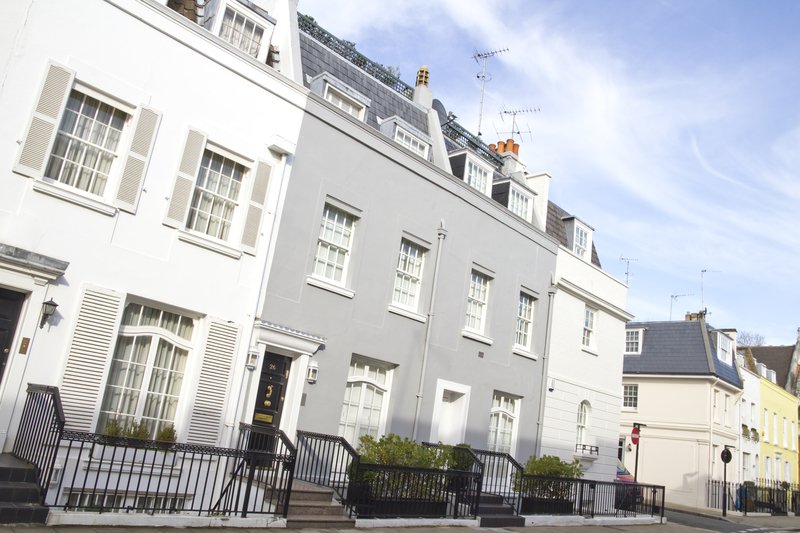
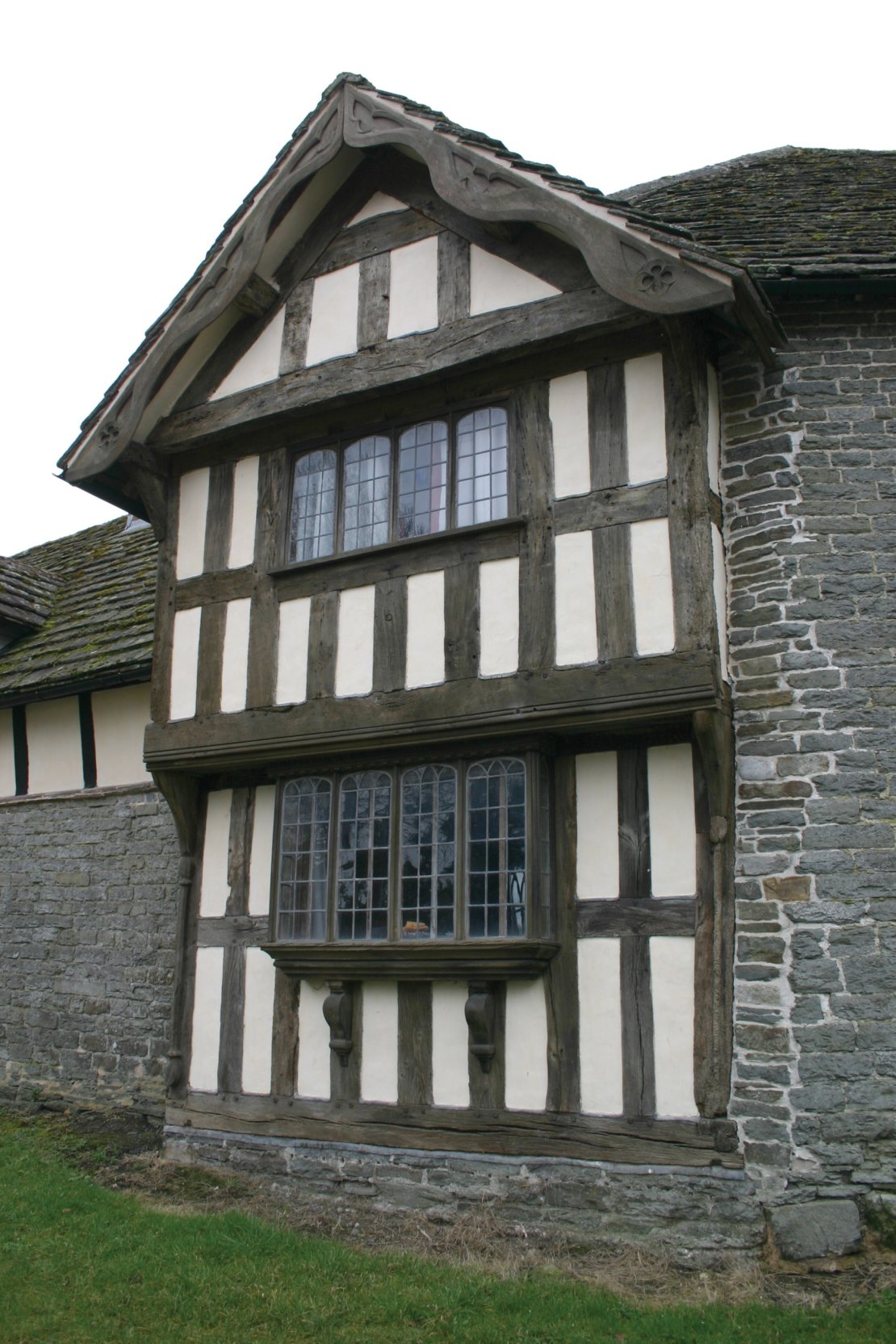 Victorian brickwork is often very beautiful and it’s a sacrilege to paint over it without good reason. However, if your house has already had it’s brickwork painted or your brickwork is badly damaged and the repairs have been covered up, you may choose to paint the exterior of your house. It’s best to choose a neutral colour from a resale point of view. A shade of white or cream is perfect, with either matching or slightly contrasting woodwork such as window frames. If half-timbering is present, you will probably choose to paint this in a contrasting shade such as black, which is the most traditional.
It should be noted that the traditional-period favourite of dark chocolate brown should be best avoided! Dark green or blue is also fairly typical of a Victorian colour scheme.
Good choices of paint colours for your Victorian front door are discussed in our further article here.
Be the first to add a comment...